Rehab Website Design Best Practices: The Complete Guide
Your website is the admissions department's front door, and most centers built theirs to impress professionals rather than calm a frightened family at 2 a.m. We cover what makes medical website design different, and why mental health design has to put empathy first. We cover ten best practices for treatment centers, a full site checklist, healthcare design tips that apply more widely, and how to keep improving it.
Your website is your admissions department's front door, and most treatment centers built theirs backwards: designed to impress other professionals instead of calming a terrified family at 2 a.m. This guide covers the practices that fix it.
One boundary up front: this is the best-practices guide, not the build service. When you want a site built to these standards, our drug rehab website design team does that work; everything below is how to evaluate, improve, and plan the site you have.
What Makes Medical Website Design Different
Medical website design carries a burden ordinary business sites never face: visitors arrive scared, skeptical, and often in crisis. Standard web design optimizes for engagement; medical website design optimizes for reassurance, and every choice on the site flows from that difference.
The practical implications run deep. A medical website must prove legitimacy fast, protect privacy completely, and remove every ounce of friction between fear and contact. Users forgive a boring restaurant site; they abandon a confusing medical website in seconds, because confusion reads as risk when health is on the line.
Medical website design also answers to regulators that ecommerce never meets: HIPAA on every form, advertising rules on every claim, and accessibility obligations on every page. Treat compliance practices as design inputs from day one, not legal patches after launch.
Mental Health Website Design Puts Empathy First
Mental health website design is medical website design with the emotional volume turned up. Visitors researching mental health care carry stigma, shame, and fear of judgment that a cardiology site never triggers, so the design must create the feel of a safe space before a single word is read.
That means soft, consistent images, human faces, and language that meets people where they are. Mental health professionals reviewing your site should recognize clinical credibility; a struggling visitor should feel none of the coldness that usually signals it. Holding both at once is the entire craft of mental health website design.
Rehab sits inside the same mental health territory. Whether the website serves addiction treatment centers, mental health practices, or psychiatry, the rule holds: empathy is the first design requirement, and everything else is implementation.
10 Website Best Practices for Treatment Centers
Here are the website best practices that separate the addiction treatment centers filling beds from the ones wondering why the phone is quiet. All ten practices below apply whether you run one rehab center or twenty.
1. Build Trust Above the Fold
Visitors decide in seconds whether a rehab center website feels legitimate, so the site must build trust before anyone scrolls. Display trust signals immediately: state licenses, accreditation badges, and certification seals.
Transparency is trust's twin: publish insurance details and the services you cover, and be honest about costs, because financial anxiety loses as many potential clients as clinical doubt does.
2. Design Features That Calm, Not Dazzle
The best design features in this industry are quiet ones. A consistent color scheme built on calming tones, generous white space, real photography of your actual facility, and typography large enough to read through tears.
Industry surveys have found that 38% of visitors leave websites due to outdated design, so a dated website costs real admissions. But the fix is not flash; it is a clean, clutter-free layout that improves the user experience, where design elements earn their place. Compassionate, human-centric visual design creates one message: families will be treated the way the site treats them.
Real, authentic images beat stock photos everywhere. For example, images of your actual rooms, your actual staff, and your actual grounds create trust that no licensed stock photo can, and matching them to your branding for treatment centers keeps the whole experience coherent.
3. Mobile Friendly Is Mobile First
Roughly 60% of global website traffic comes from mobile devices, and in this industry the share skews higher because crisis research happens on phones, in private, often at night. A mobile friendly site is not a version of your website; it is your website, and it is where potential clients meet you first.
The stakes are blunt: industry studies have found 73.1% of users leave non-responsive websites. Responsive design that adapts to all screen sizes, tap-sized buttons, and a click-to-call number in the header are the baseline. Mobile optimization is where admissions are won, so design for the phone first and let the desktop inherit.
Test the site on real mobile devices monthly, and watch real users move through it. Mobile optimization decays as content gets added; a website that was mobile optimized last year may not be today, and nobody notices until the calls slow down.
4. Speed Is a Design Decision
Fast loading time improves user experience, search rankings, and admissions in one move. Every second of delay bleeds users from the website who are already looking for a reason to put the phone down.
Compress images, lazy-load videos, keep scripts lean, and measure loading time on a mid-range phone over cellular, not your office fiber. Users never notice performance when it works; they only feel it fail.
5. Navigation That Never Makes Anyone Think
Industry research cites poor navigation as the top frustration for 61.5% of users, and on a rehab center website confusion becomes abandonment fast. Keep the navigation bar simple, for example: Programs, About, Admissions, Insurance, Contact.
Every page of the site should answer "where am I and what do I do next" at a glance. Clear, frictionless navigation is empathy expressed in structure: a family in crisis should never have to think about how your site works.
6. Website Content That Answers Real Questions
Content-rich sites win because they answer the questions families actually type. Cover treatment programs in depth, explain treatment options and services plainly, outline the rehabilitation process step by step, and create a robust FAQ that addresses cost, insurance, visitation, and what to bring.
Detailed website content does double duty: it reassures potential patients and it feeds the search engine. Sites with blogs earn up to 434% more indexed web pages by industry estimates, and regularly updating content keeps the site relevant to both audiences. High-quality content assures visitors of your capabilities before a single conversation happens.
Success stories belong in this mix. Real success stories and testimonial videos help prospective clients see themselves in recovery, and our chapter on how to get client testimonials covers how to create them legally and well.
7. Clear Calls to Action Everywhere Doubt Lives
Every page needs clear calls to action: call, verify insurance, schedule appointments. CTA buttons should be high contrast, consistently placed, and phrased around the visitor's need ("Verify Your Insurance") rather than yours ("Submit").
Make crisis contact immediately accessible from every screen, because the moment of willingness is short. If your site gets traffic but the phone stays quiet, the CTAs are usually the leak; our breakdown of why is my website not converting diagnoses it.
8. Accessible to Everyone Who Needs You
Accessible design is both an obligation and an advantage. Give users high contrast, large readable typography, alternative text on images, captions on videos, and full keyboard navigation.
Accessibility overlaps almost perfectly with designing for people in distress: simple language, clear structure, and forgiving forms serve users with disabilities and users in crisis alike. Design for the hardest moment and everyone benefits.
9. HIPAA-Compliant Forms and Privacy by Default
Every form, chat widget, and tracking pixel on a treatment site touches protected health information, so HIPAA compliance is necessary for all data collection on the site. Use compliant form handling, encrypt everything, and audit your analytics stack for what it captures.
Privacy is also a design message: visible reassurance that contact is confidential lowers the barrier for the person hovering over the form. Say it plainly near every field.
10. SEO Built Into the Design, Not Bolted On
A strong website is designed to be found. Site structure, heading hierarchy, page speed, and mobile optimization are all elements search engines read as signals, which means design and SEO are the same project wearing different badges.
Local matters most in this industry: potential patients search by city and insurance, so create location clarity in the design and pair it with local seo for rehab centers and google business profile optimization. Considering 75% of users reportedly never scroll past the first page of search results, design decisions that improve search rankings translate directly into more traffic and more potential clients; a behavioral health seo company builds the strategy on top of the foundation.
The Rehab Center Website Checklist
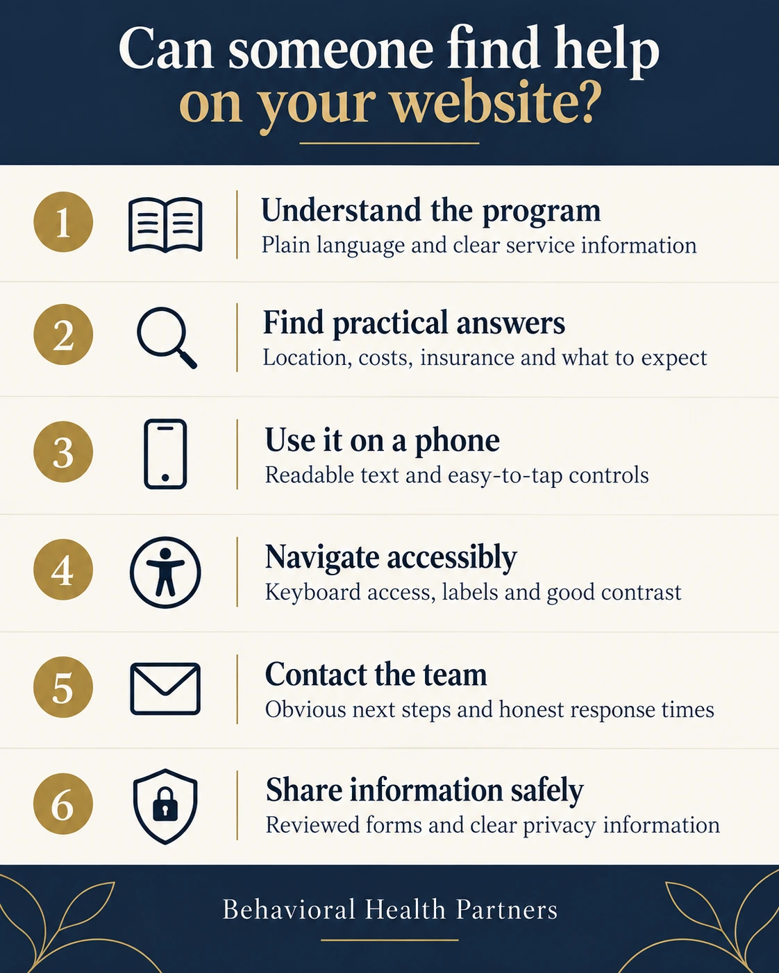
Every rehab center website needs these on day one: licenses and accreditations displayed, staff pages with credentials and faces, program and services pages for every level of care, insurance verification, clear location information with directions for the first visit, a robust FAQ, testimonials with signed releases, and a crisis-accessible phone number on every screen.
What a Drug Rehab Website Adds
A drug rehab website adds industry-specific weight: detox and withdrawal information written with medical accuracy, family resources, and videos showing what the first 24 hours look like. A clear outline of the process alleviates the uncertainty that keeps people from calling any drug rehab at all.
Print this list and walk your current site against it. Most addiction treatment centers find three gaps in the first five minutes, and every gap leaks prospective clients to a competitor whose website answered the question.
Healthcare Website Design Tips That Apply Beyond Rehab
These healthcare website design best practices travel across every specialty: user centric design that starts from patient questions, videos that humanize clinical services, and user friendly design patterns that never make users work for information.
A few practices worth stealing from the wider medical website design world, for example: put wait-time and process expectations on the page, show the faces patients will actually meet, and write at an eighth-grade reading level without condescending. The best user friendly experience in healthcare feels like a calm nurse: clear, warm, and never in a hurry.
Whether the website serves addiction treatment providers, dental practices, or primary care services, a well designed website makes a huge difference to the business in the same measurable ways: more contact, longer visits, and users who arrive at the first call already half-convinced.
Measure, Update, Repeat
Site design is never finished. Watch converting visitors versus bouncing ones, track which pages turn potential clients into calls, and let real users drive the next revision. Videos keep website visitors on pages longer, per Wyzowl's research on the medium, and our video content ideas guide creates that pipeline.
Regularly updating the website's design and content compounds: fresh images each season, current staff pages, and dated elements pruned. Sites that improve user experience every quarter outrank and outconvert the ones redesigned once every five years, and increase visibility a little more with every iteration.
When these practices, content, and digital marketing pull together, the site stops being a brochure and becomes the business engine; that is the standard our addiction treatment marketing work builds toward for every client.
A good rehab website builds trust instantly with licenses and accreditations, works flawlessly on mobile devices, loads fast, and guides visitors to contact with clear calls to action. Design with empathy first: calming visual design, real photography, simple navigation, and content that answers the questions families ask at 2 a.m. Every element should reduce fear and friction.
Why is mobile optimization so important for treatment centers?
Because crisis research happens on phones. Roughly 60% of web traffic is mobile, the share runs higher for addiction and mental health searches, and industry studies find 73.1% of users abandon non-responsive websites. A mobile friendly user experience with click-to-call, fast loading, and readable text on small screen sizes directly determines how many potential clients call.
How often should a treatment center update its website?
Continuously in small ways, substantially every two to three years. Refresh content, photos, staff pages, and blog posts monthly or quarterly, since regularly updated sites hold rankings and user trust better. Plan a fuller design review when the site starts feeling dated, because industry surveys find 38% of visitors leave outdated designs, and outdated in healthcare reads as untrustworthy.
Adam Vibe GuntonFounder and Managing Partner, Behavioral Health Partners
Adam Vibe Gunton is an addiction recovery expert, entrepreneur, marketer, brand strategist, and speaker dedicated to advancing the behavioral health industry. As Founder and Managing Partner of Behavioral Health Partners, he has worked across treatment-center development, operations, branding, PR, SEO, advertising, and growth strategy. Combining professional experience with his own lived experience in recovery, Adam brings a unique perspective on how treatment organizations can build trusted brands, reach more people, and create a greater impact.
Thirty minutes on video with Adam directly, camera on, screen-sharing your own online presence and your top three local competitors. If we are not the right partner, we will tell you that too.